Product design
Quantitative & qualitative research
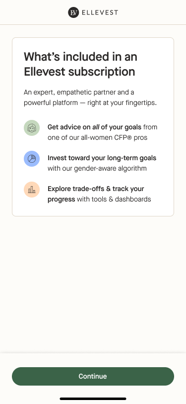
Design system
Strategy
Increased Day 1 Conversion rate by 17%
The results
Increased checkout completion by 15%
Increased email collection by 30%
Increased registration by 4%
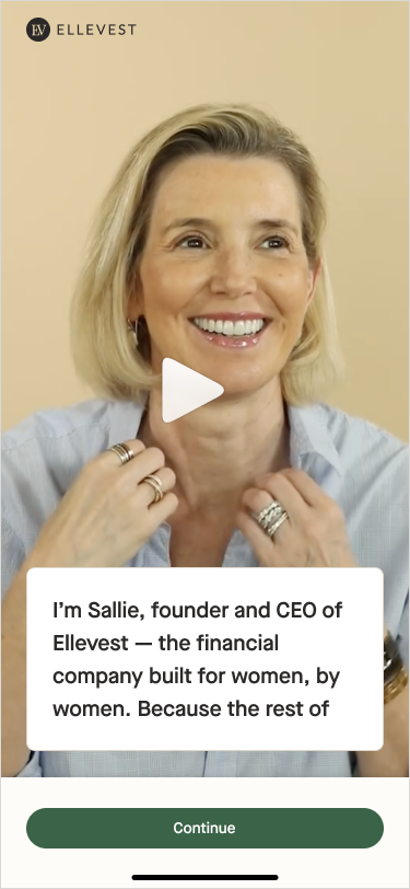
Introduction
The problem
Ellevest offers comprehensive financial guidance to help women build wealth – from automated investing to financial planning and advice. However, the onboarding flow was tailored for a pure robo-investing experience, which didn’t align with our holistic vision and product offering.
The opportunity
To better support our users throughout their financial journeys by offering a seamless onboarding experience that smoothly guides them towards their initial actions, ensuring the product effectively helps to solve their needs and meet their personal objectives.
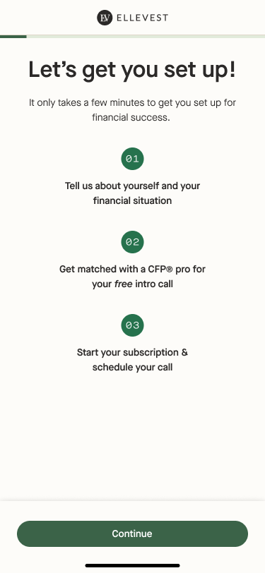
The goal
Reimagining onboarding so that it clearly fits and reflects the holistic product offering. To ensure a seamless sign up experience for users that minimizes points of friction, we will:
See improvement in our onboarding conversion
Build trust with our users
Unlock technical flexibility + velocity enabling us to more quickly test and validate product market fit through future product iterations
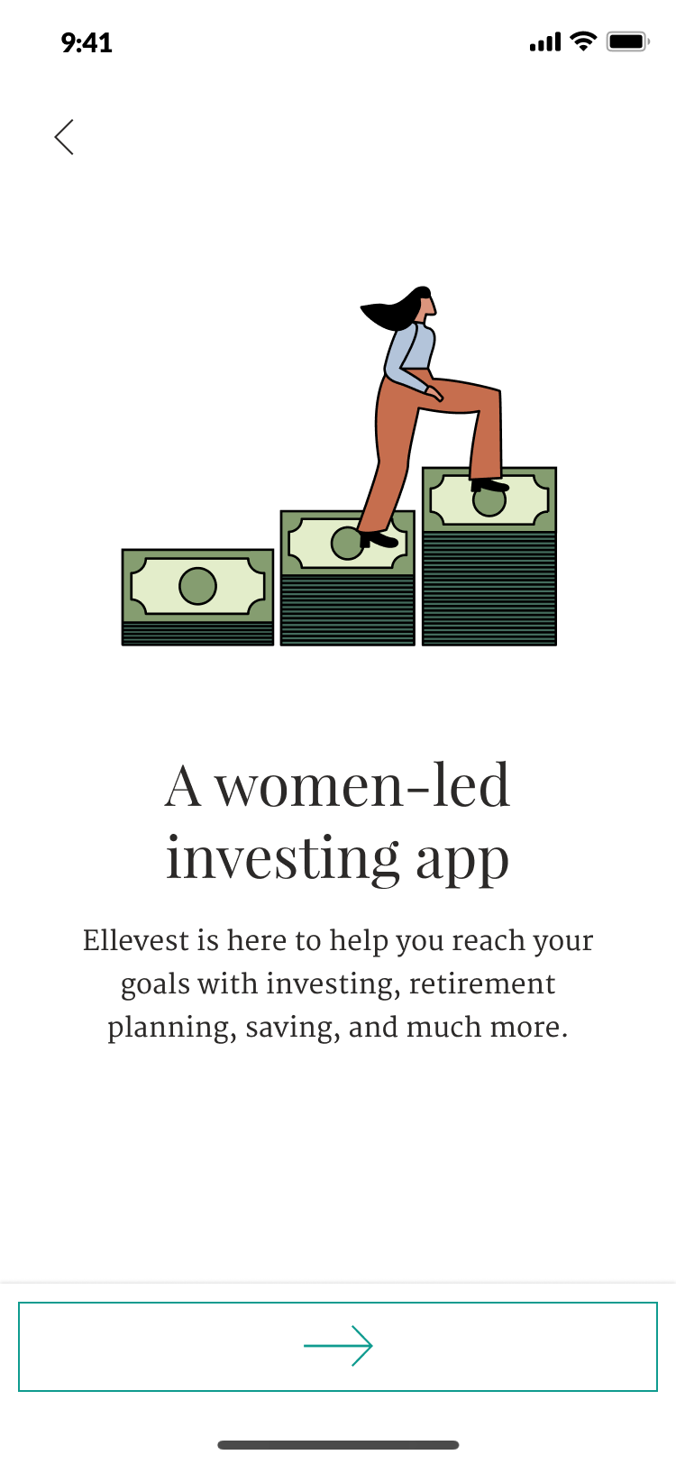
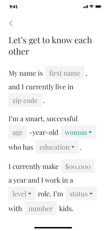
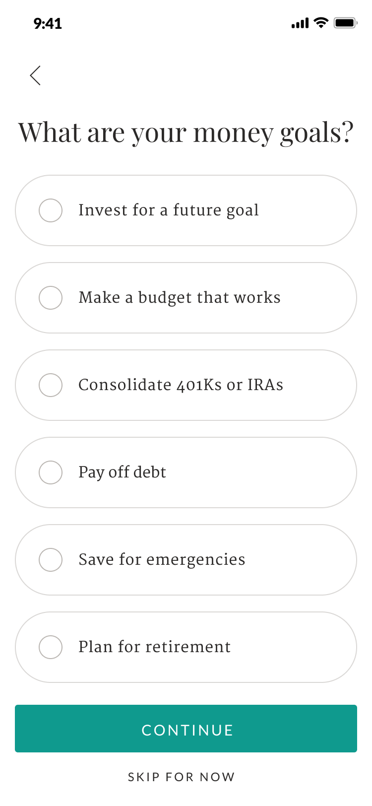
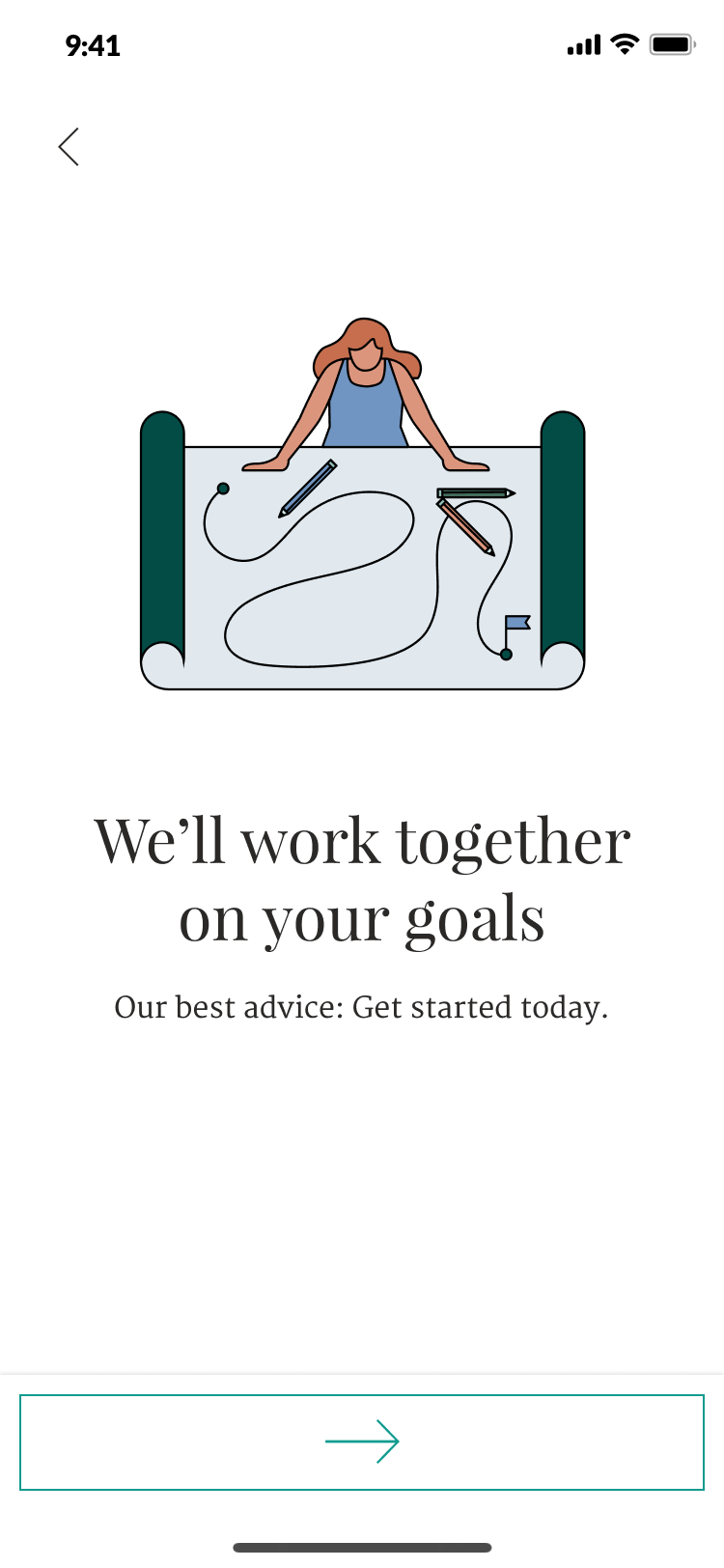
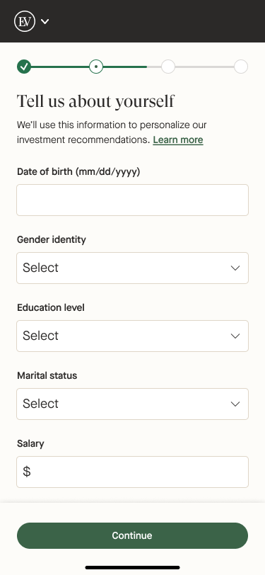
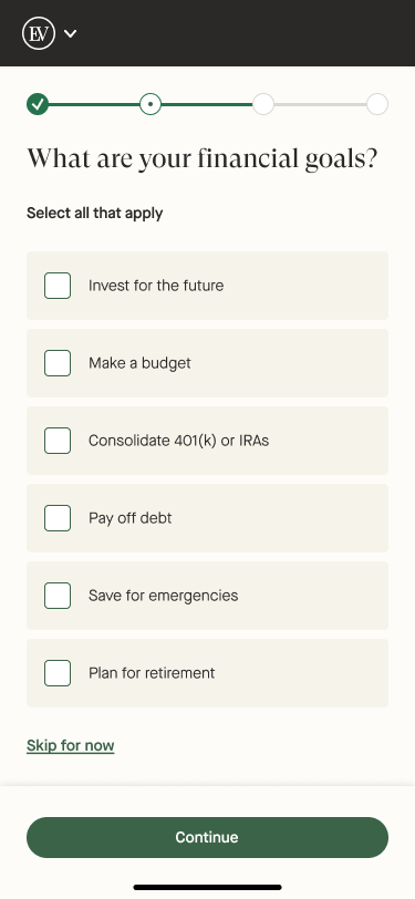
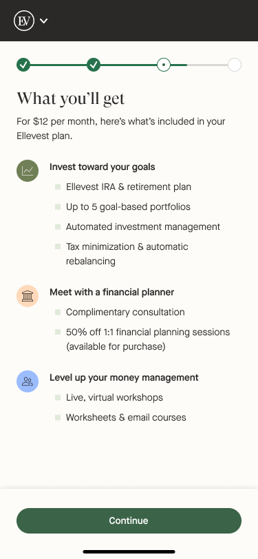
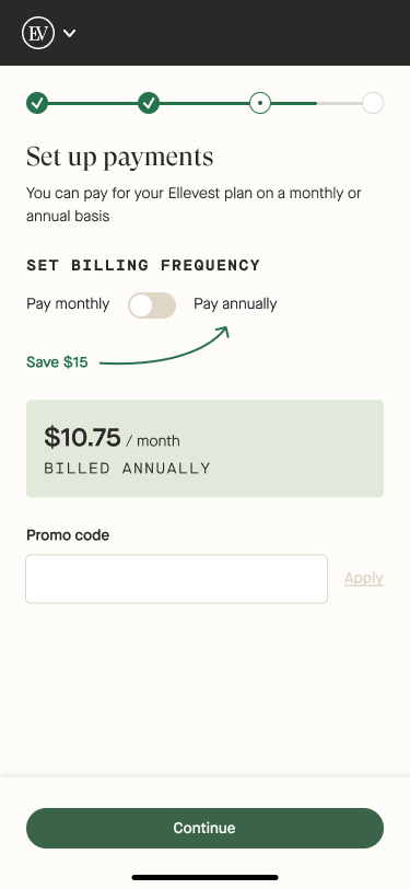
Some screens from the original onboarding
Objectives
Rebrand to our new design language
Upgrade technical back-end
Set us up to be able to iterate quickly on the MVR
Research & discovery
Testing history
Throughout 2021 and 2022, the product growth team at Ellevest ran a slew of tests against the existing onboarding flow. It had been designed and built in 2016 and conversion had gone fairly stagnant. With iterative A/B testing, they targeted the worst performing screens with aimed improvements. Over time there were slight improvements, but nothing to move the needle that much.
I joined the team in 2022 and picked up where the team left off. We quickly realized with our expanding offering it was necessary to revisit how we approached onboarding in order to make a big enough impact to align with our growing business needs. With a needed overhaul on the horizon, I started off with some discovery.
Stakeholder interviews
One of the biggest hurdles was the technical improvements required to simplify the back-end of onboarding. After years of being iterated on, nothing was consolidated so the flow was disjointed and incredibly difficult to update efficiently. After consulting with the stakeholders and engineers we decided a complete rebuild for the new onboarding flow was imperative, not only to get valuable data out of our work, but also to allow us to continue to improve upon it quickly and seamlessly.
We were able to come to an agreement on an MVR and start working towards that.
Objectives
Brand consistency
Simplify & clarify
Improve mobile drop-off
MVR Design
Brand consistency
Our top-of-funnel channels had been rebranded and our product had not yet caught up. We considered this as an important factor to lower performance as folks transitioned through our user journeys from TOFU through onboarding.
Because of this, our onboarding experience was vastly different in appearance, and verbiage. It was also very robo-investing focused, which conflicted with our larger offering around Financial Guidance. My main goal behind the redesign was to implement a more cohesive brand story that continued through every channel to build trust with our users.
Simplify & clarify
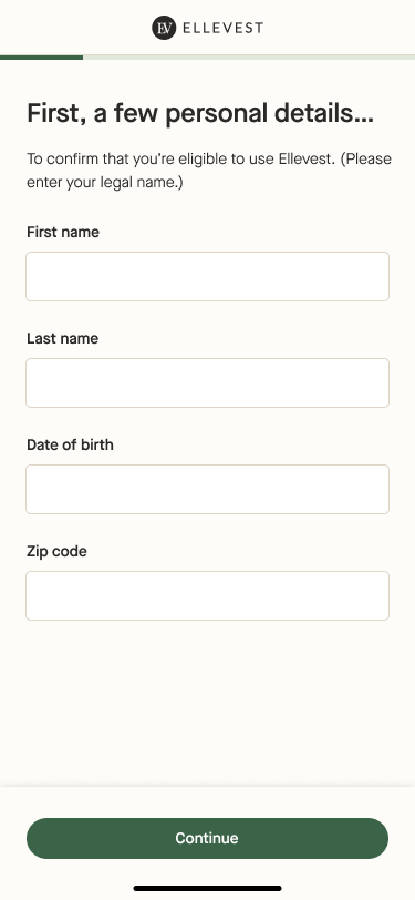
Another thing we struggled with was that we gave little to no context to all of the inputs we required users to fill in onboarding. We asked about money goals, we asked about number of children, level of education, and more, but we didn’t clearly state what exactly we would be using that information for. To further build trust, a large focus was to batch the data collection in an intuitive way with clear, concise copy to accompany so that our users understood and felt comfortable sharing that information. This would ideally encourage them through the flow faster, and convert with more confidence than before.
Improve mobile drop-off
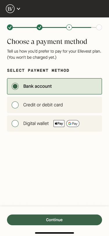
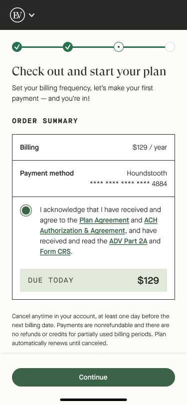
There were a handful of specific screens that had the highest rate of drop-off. The were particularly impactful on mobile conversion so we wanted to target those from a mobile-first perspective. The main areas of concern were the bank link page (which was just a tough screen in practice, not just within our flow), as well as some static pages and checkout.

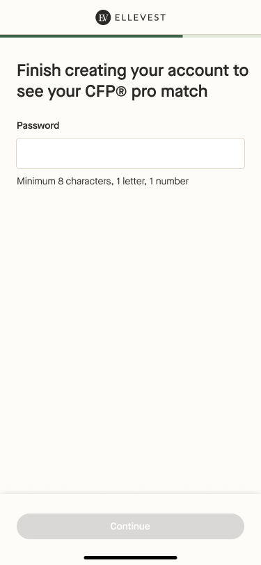
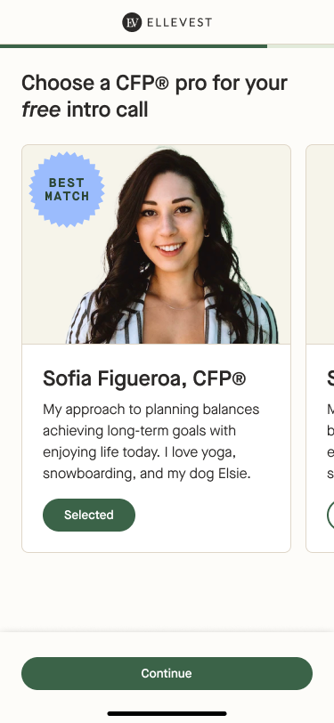
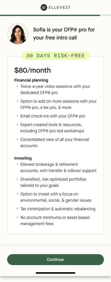
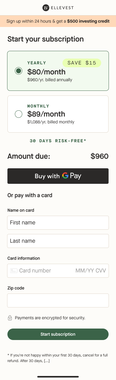
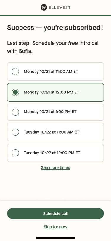
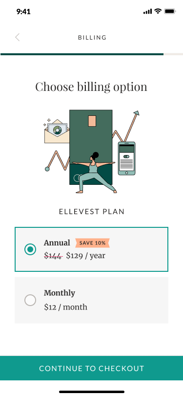
Majority of screens from MVR


Iterations and enhancements
Onboarding drop-off survey
After launching our MVR in an A/B test, we reached out to those users that had dropped off in the variant experience to find out what were the biggest areas for improvement. The main issues were clarity around what the subscription actually provided, and how that contrasted with what our offering was (and what was or wasn’t included). Otherwise, it was nebulous reasons, like not being ready to actually join, or they didn’t want to pay for a subscription.
Iterative “fast follows”
Some of the improvements we had proposed initially were pushed as a fast-follow, as they were not mission critical. These were things like screen redesigns (leaving old branding on static pages), not including new Value Proposition pages, a rebranded top navigation bar, certain minor functionality, among other things.
Enhancements
As this project progressed forward, additional enhancements to the onboarding experience were added to the roadmap based on business needs. One of the main ones was introducing alternative ways to pay besides bank link. Since bank link was one of the harder sells to folks, we wanted to see if allowing them to pay with credit card or mobile pay would increase conversion.
We quickly pushed out designs and tested it into our new onboarding while we continued to iterate. It was very successful and helped us get to a point where we were comfortable committing to the updated onboarding 100%.
Conclusion & next steps
After 2 years, we had some valuable metrics to give us the confidence to move forward with “V2” at 100% across the digital experience. The main consideration was that ARR (annual recurring revenue) was performing slightly better with +$125K salary users, number of calls booked and Financial planning purchases. This encouraged us to fully deprecate our old onboarding flow.
Immediate next steps
Prioritize Checkout Drop-off Emails to help improve post day 1 conversion rates
Investigate failed payment emails for credit card users to boost paying rate among credit card payers
Deprecate V1 code to make way for future development and improve platform stability
Future
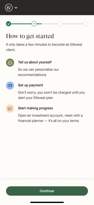
The next step to integrating our experience with our Financial Planning offering was to focus on a Financial Planning-first onboarding flow, with an easy off ramp to investing. Below is the early designs we worked on and began running through user testing as an ideal future state.
Financial Advice First Flow